
 The importance of color in graffiti is often taken for granted. Every day we take in an infinite amount of pieces where colors —combined more or less skillfully— capture and captivate our attention. But sometimes the result in terms of the chosen color range does not depend only on the dexterity or courage of the piece’s author. Conditions like the one we are going to talk about make the finish of a piece seem surprising to us. Today we are talking about color blindness.
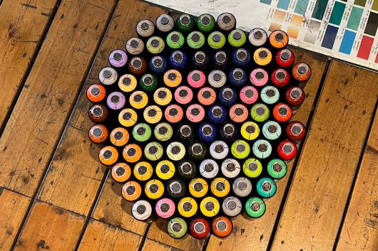
Color blindness, also known as chromatic vision deficiency, is a condition that affects the way people see colors. It is estimated that it affects about 8% of men and 0.5% of women worldwide. Color blindness is usually inherited and occurs when the cones in the retina of the eye —that are responsible for detecting color— are absent or do not work properly. There are three types of cones, which work during the day and in illuminated environments: one especially sensitive to red light, another to green light and a third to blue light. These are connected to the brain’s vision centers through the optic nerve. There are different types of color blindness, and the degree of affectation ranges from the inability to differentiate any color —the so-called achromatopsia— to the most common where the difficulty is in discerning shades of red, green or blue. That means that those afflicted have difficulty distinguishing between colors that contain red or green, (purple, blue, pink, orange and brown). Another type of color blindness is the one that makes it difficult to differentiate between colors that contain blue or yellow (green, purple and gray). To detect or diagnose color blindness, the most common procedure is to use Ishihara Cards, a series of 38 plates in which a number has to be identified.
 In short, color blindness can have an impact on a person's daily life, but despite the challenges it poses, there are tools and techniques available to help people cope with this condition. But how does it affect graffiti writers? To answer those questions we spoke to 4 colorblind writers and here's what they had to say. Discover their stories with us and if you suspect that you may suffer from a certain degree of color blindness, at the end of the post you can take the Ishihara Card Test.
Rigs One
This Dutch writer started painting in 1988. He also writes Heat and is a member of the Bomb Steady Crew, Vandals BSV and IMP DTO. His style is a mixture of old New York style and influences from the old school Holland kings. Rigs discovered as a child that he could not distinguish between purples and blues, pastels or browns and greens. A doctor at school confirmed the diagnosis.“I think color blindness it’s more a limitation to me, because I dislike most color schemes I come up with, the colors won’t come out that good.”
 Do you try to choose a range of colors based on the perception of the non-blind? Mostly on non colorblind people. Do you recognize the pieces of other colorblind writers by their colors? Nope , but I don't know any other colorblind writers myself. Are there writers that surprise you with their chromatic choice even though you know that what they perceive is not what has been painted? Yes there are some people , with real cool color combos in my eyes , I like bright colors and white outlines. I need big contrasts between the colors!
Louane
He is a Swiss writer who started painting in 2010 and belongs to the LES UNS crew. He discovered he was colorblind as a child, while coloring at school. It was his teacher who noticed. He remembers that he had to color some penguins with markers and he did it with dark green thinking it was black. The teacher called the parents, but he didn't understand the problem. He was tested and the result was positive: he was color blind like his grandfather.“I wouldn't really know how to answer, I don't know what it's like to see 'normally' - I can't compare. In any case, it has never stopped me from painting.”
 Do you try to choose the range of colors based on the perception of non-colorblind people? Absolutely not, I never asked myself that question. Most of the time, I paint walls with recycled paint, so I don't really choose the colors. For example, right now I have several cans of green paint, so all my last walls are green, I usually add colors that go around it. What's important to me is contrasts of light/dark, warm/cool, pastel/vivid, so if I only have green and I want to paint a penguin, I don't mind painting it green. What is important for me is that there is a harmony in the end and that is mostly a question of feeling. Do you recognize other colorblind writers' pieces by the colors in the piece? No, I don't think so, but I've never asked myself the question. It happened to me many times that writers with whom I paint regularly, when I told them that I was colorblind, answered me 'aaaah now I understand better why you choose strange colors'. I don't see the difference, there is nothing weird for me. I also know a lot of these writers who are not colorblind but who don't understand colors and can't create original harmonies. Are there writers who surprise you by their color scheme even though you know that what you perceive is not what is painted? What I see is what is painted. I don't feel like I'm seeing 'fake' at all. However, it is true that I see less colors than others, for example I see few shades of purple, I distinguish less browns - but I believe that a good harmony of colors would also work in black/white. It must also be said that for me the colors are not very important and that is not where we can really innovate. I compare it with music, the harmonies (chords) used are the same for a long time, and there are no new ones. What counts is what makes up the style; the references, the humor, the noise, the voice, etc…
Pako
Pako is a writer from Barcelona, member of Hawaii Computer and BlackFoots crews. He started taking pictures and tagging in 1991, but it wasn't until 1994 that he made his first piece. He discovered he was colorblind as a child, coloring his school notebooks. Over the years he got used to it and it was no longer a problem... he tells us that he tries to make the colors contrast.“It's a perfect opportunity to create my own ranges, but I wouldn't call it highlighting, it's a way to add color according to my vision.”
 Do you try to choose the range of colors based on the perception of non-colorblind people? I improvise the color ranges on the actual wall. I can't take the colors in my head from home (as I see most people do). That’s impossible for me. If I see some colors from a piece, I don't know what they are, I couldn't copy them. In fact if I look at my own pieces from a long time ago I couldn't tell you the colors. Do you recognize other colorblind writers' pieces by the colors in the piece? Impossible for me. When I look at people's pieces, I would barely be able to get a single color right. Are there writers who surprise you by their color scheme even though you know that what you perceive is not what is painted? There are many people whose colors I am amazed with, but I give more importance to the shape of the letters and how they fit on the wall. Many times, when I paint, I use only a few colors. I like the letters to look nice and clear (and if it doesn't look good, too bad). Out of all the people I've painted with, Sune is one of the ones I like the most when it comes to adding colors, and it’s surprising the level of improvisation involved when it comes to adding them.
Cide
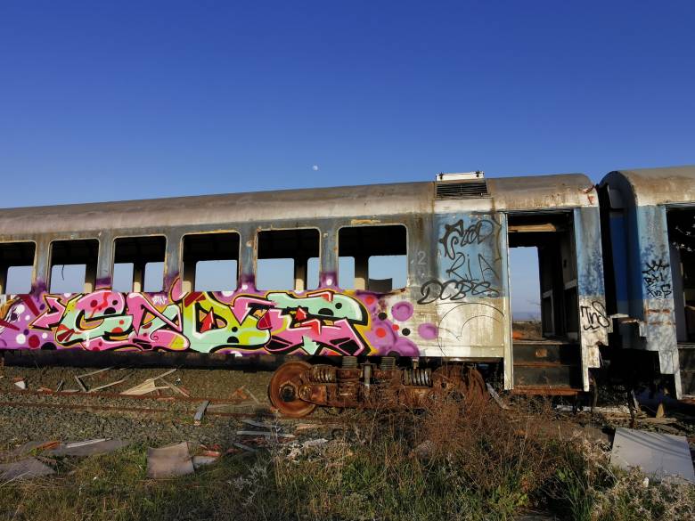
This Danish writer began to paint in 1988, when he got caught by graffiti when he was fourteen years old. One of the reason was Daim ( couple of years older) being and painting in the same school and her sister’s boyfriend who was into graffiti too. He started painting in 1991, and hi has written several different names like Rae and Teas. In 1995 he began to write Cide, and became a member of BTN Crew thanks to Form and Aids (Golden Green). BTN were at that moment Form, Aids, Enta, Eiser, Mint, Kewen (TCD) and Trol. Later Samz and Yugo joined the crew. He and Desk7 form THY (Therapy) Crew, and invited Lady Wave (AFC), Home 76, Jeks (Cas Crew) and Amit. His style is a mix between the Hamburg style and international, with the color scheme from Denmark. He found out the color problem when he was 6 years old. Very often he named colors wrong.“I have the red and green problem that goes in the end to all similar colors. Blue/ lilac, pink/grey, brown/red, green/ brown, etc... For sure i construct colors in a different way compared to other writers. Planing concepts is always difficult for me because i use always wrong colors. People often say i paint with too much different colors.. like an overdose, i cannot See that really. But for sure... it makes my pictures interesting. “
 Do you try to choose the range of colors based on the perception of non-colorblind people? I never tried to overtake color ranges or schemes of other writers. I realized that my pieces will not work with that. Most important thing is the 'bright and dark' factor. Between that spectrum colors are not so important for me. The shining effect when it is finished is the point. If the piece is yellow or blue based it does not matter for me. I always hope that colors are burning at the end. Sometimes i seriously fail! Sometimes it burns.. Do you recognize other colorblind writers' pieces by the colors in the piece? I do not recognize strange colors of other writers. I like the pictures or not. At the end you are 100% free with your choice but my tendency is the more color, the better... maybe because I detect 20% less of that what happens on the wall! Are there writers who surprise you by their color scheme even though you know that what you perceive is not what is painted? Of course there are plenty of stylers that color schemes I like! And I will never can watch them as you can do. Most interesting is the hyper realistic spraying in order with colors. I could not do one shadow right.
  You can do the test here.
by mtn-world via Montana World
Keine Kommentare:
Kommentar veröffentlichen