
 A few years ago we wrote an article about Montana Colors ads in graffiti magazines. This was the first way of promoting our brand, and in the report we took a nostalgic tour of some of the most iconic print ads during the early years of our brand. Five years later we present an update on this theme to celebrate World Advertising Day. We’ve selected ten ads published recently in different graffiti and art magazines with the hidden backstory behind various messages.
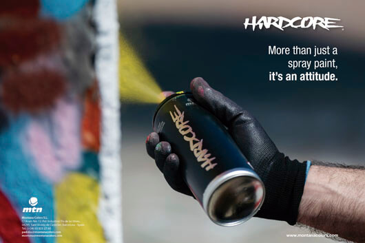
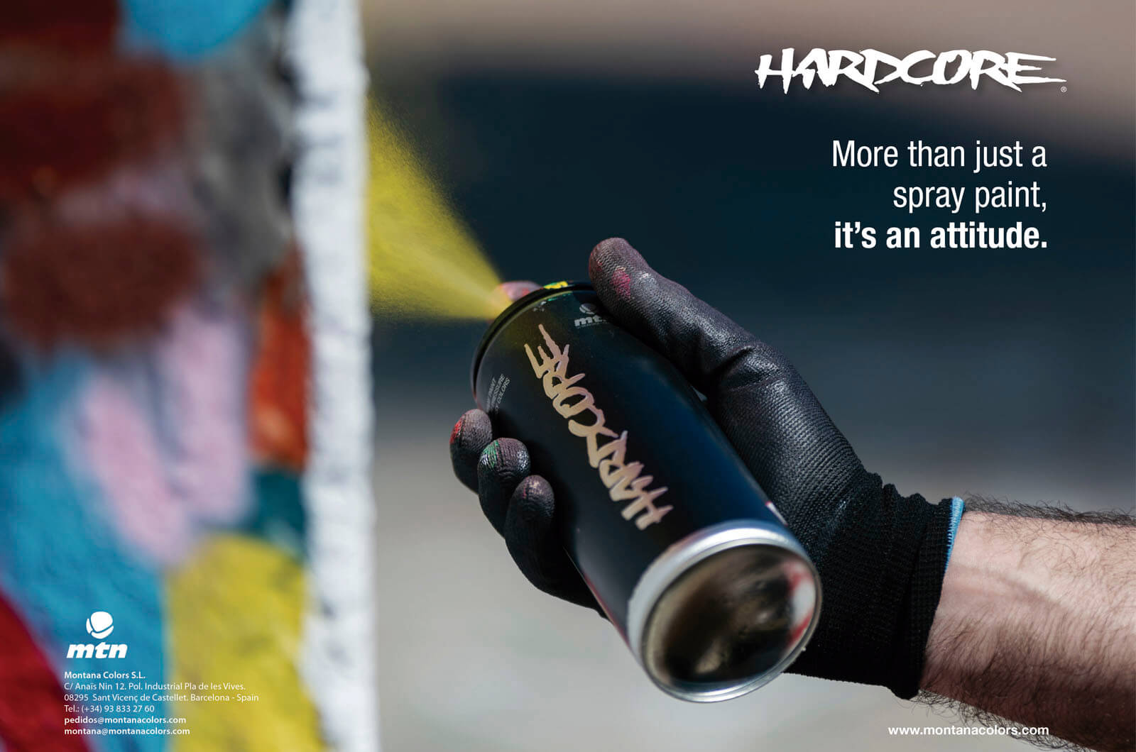
CLAIMING THE ORIGINS
To celebrate our 25th anniversary, the Hardcore range brought back the famous design that had been replaced in 2013. Promoting the pioneering origins of the brand, we decided to riff on the phrase "I Was Here", summarizing the essence of the brand and main motivation of the graffiti. The advert underlined our historic achievements and the community behind the brand, because we all form part of the MTN Crew. Zoner and ACBR were the writers in action in the photograph.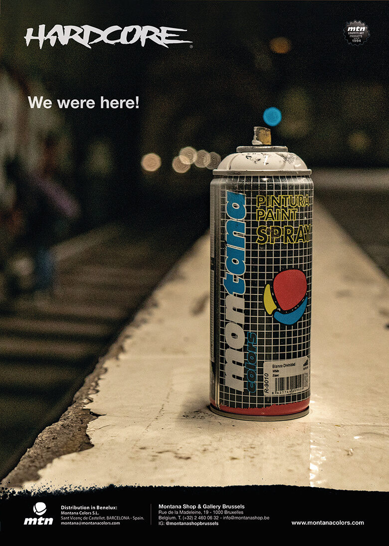
GRAFFITI HAS NO GENDER
The fact that two writers appear in this advertisement shouldn’t matter. At the end of the day, there are graffiti writers many different gender identities. The remarkable aspect of this ad is the presence of Yubia and Dune, two established names in the Barcelona graffiti scene.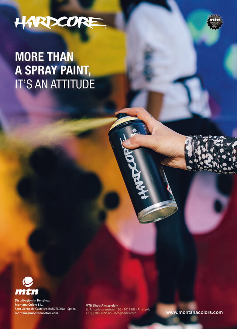
GO BIG OR GO HOME
You can often find idioms in our ads. In this case we wanted to focus on the main feature of the MEGA: the sheer size of the can and its spray. Quantity, quality and scale are the three variables that earn kudos in graffiti. The star of this ad is the Swedish writer Ellr, photographed at the video shoot that accompanied the campaign.
THE PERFECT CHOICE
Nitro and silver are the perfect combination for your silver pieces. In this ad, we wanted to showcase this perfect combination, referencing the location of the shoot. Dubs are an omnipresent feature of train tracks around the world, and Moma FYL was the writer hiding his identity with an aerosol in a photo by Fozoin.
THE MESSAGE
“Because color is life.” One of the slogans that you can find on the aerosols from the 94 range, produced from a typography designed by Ausias Pérez. In this case, the phrase serves to accompany an ad featuring the writer Fres NCC VTM in a photograph shot by Clara Antón.


by admin via Montana World
Keine Kommentare:
Kommentar veröffentlichen